New Project: AI-Powered Market Research
A few months ago, I posted about a project for Mitchell Henderson, the CEO of Clear Seas Research, a market research company in Troy Michigan. Here’s a link to that post: link.
Here’s what that project looks like:
That was actually the second project we worked on together. Today I’m posting about the first. Technical details are at the end, if you’re looking for those.
What’s the product?
It’s an AI-first platform for understanding market research data.
Mitchell and I worked on it for a year and half. March 2022 to August 2023.
The team has also grown during that time. Mitchell’s brought on four more software engineers over the past 6 months, through the TopTal contracting service. I performed the interviews and served as their engineering manager. All four are superb engineers. They’ve been awesome to work with.
This is one of the “dashboards” in the platform: dashboard.clearseas.ai/waterHeater
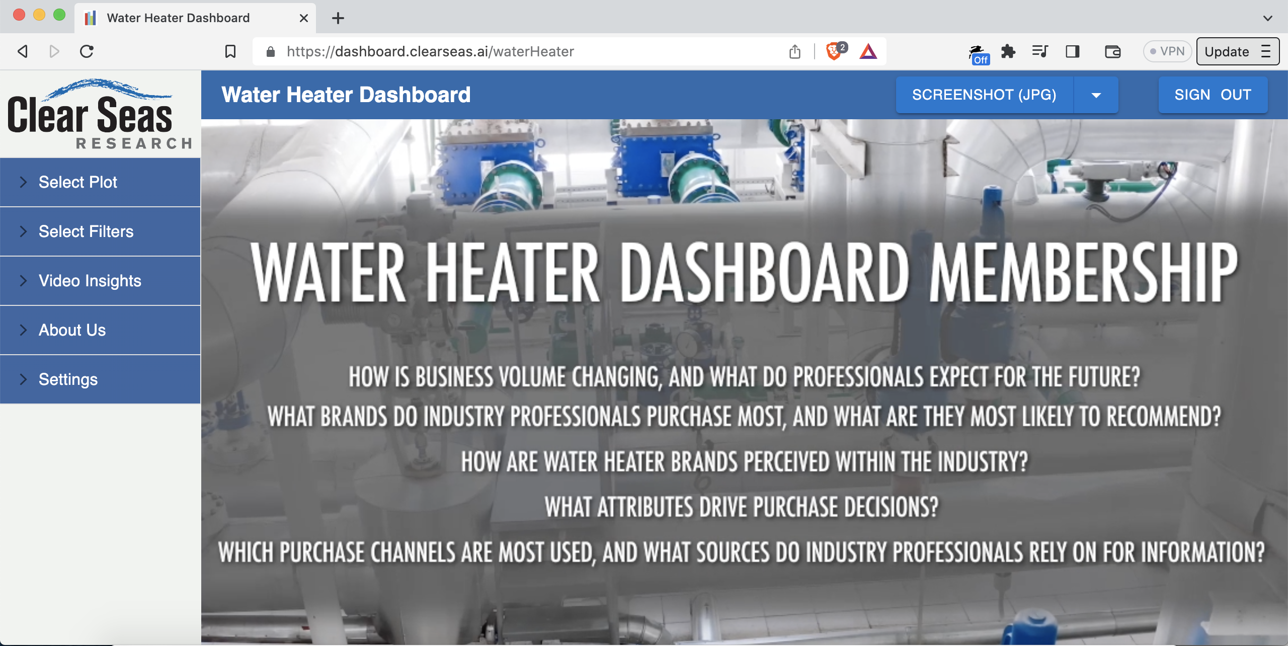
That dashboard is all about water heaters. The intended users are employees of water heater manufacturing companies.
The whole platform has about 90 different “dashboard types”. To give economic scale, a given dashboard sells for about $100,000/year, sometimes bundled with a separate research report.
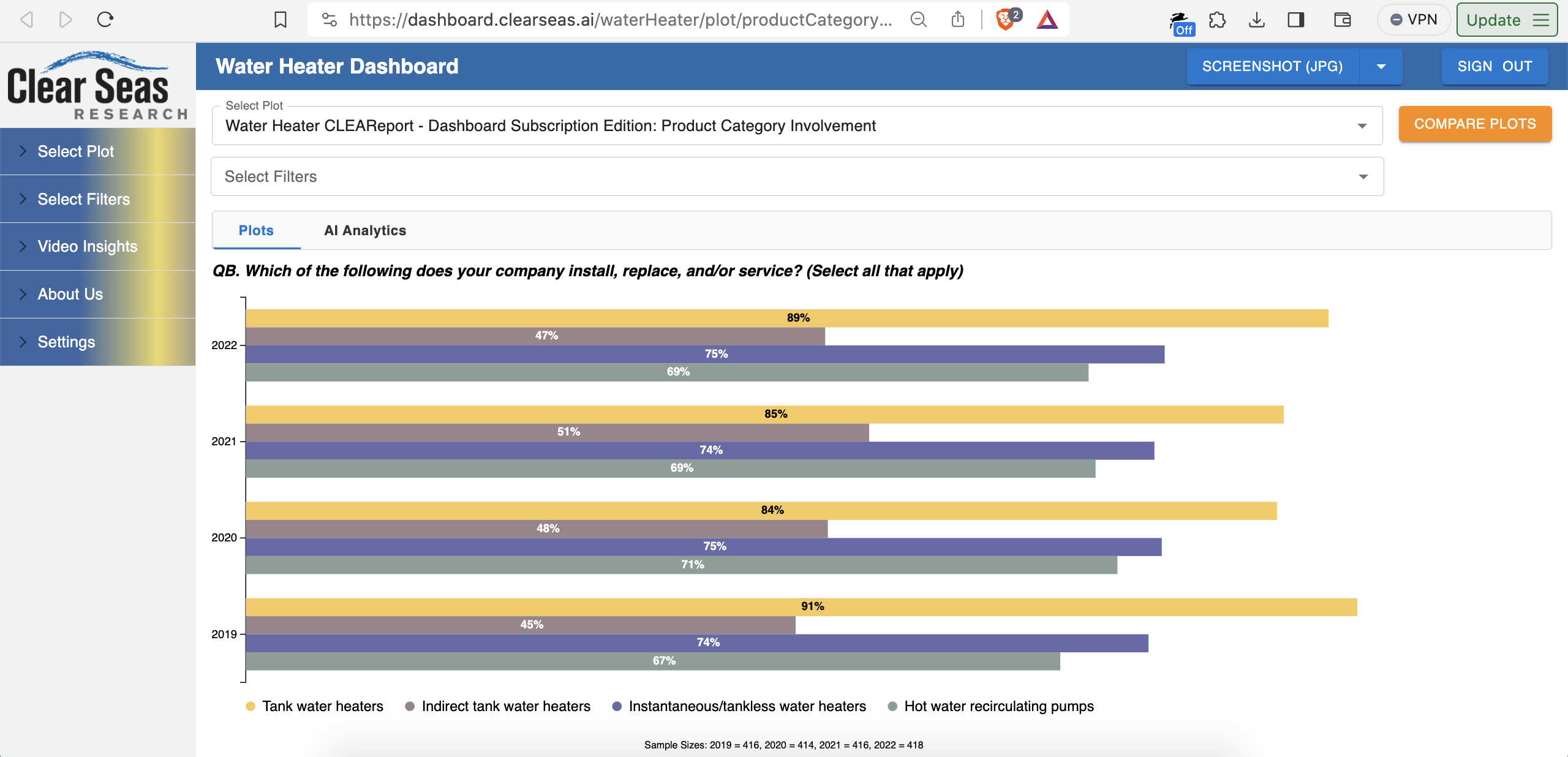
The core of the platform is its plots. For example, let’s say you wanted to know which types of water heaters are most popular, and to see the trend over the past three years. The types are “tank” (has a water tank), “tankless/instantaneous” (no water tank), and so on. In market research terminology, this is called “product category involvement”.
Here’s a chart with that breakdown: dashboard.clearseas.ai/waterHeater/plot/productCategoryInvolvement
A “killer feature” is side-by-side chart comparisons, including with different filters on the left and right.
For example, what’s the product category involvement for small companies versus large companies?
In other words, does the choice of what kind of water heater gets installed depend on whether it’s installed by a small plumbing company or a large plumbing company? Do small companies hate dealing with tankless for some reason?
Here’s your answer: tinyurl.com/mrfszzv4
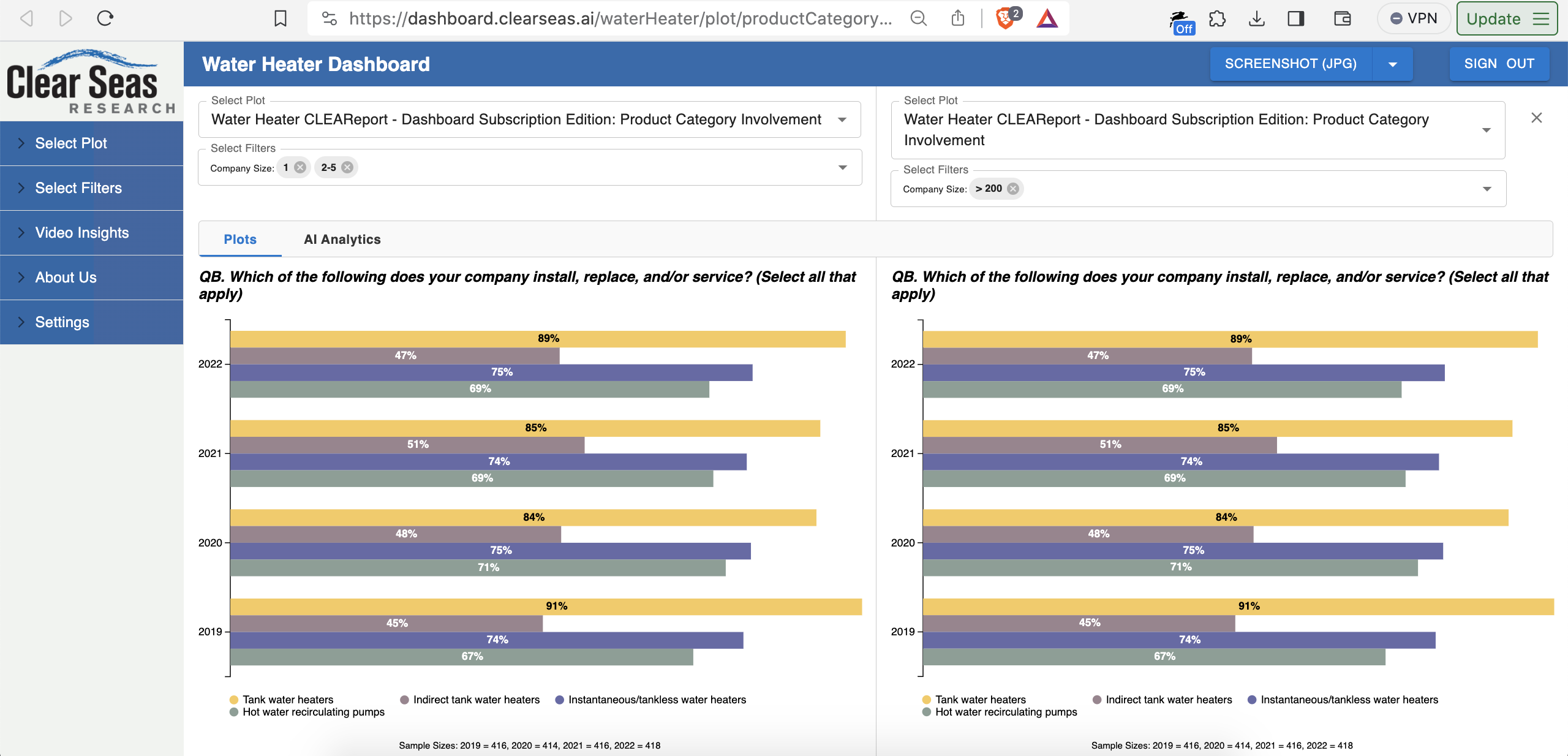
Small plumbing companies keep it simple. They deal less in indirect tank heaters.
An indirect tank water heater heats the water using heat from the home’s furnace, employing a heat exchanger. Sounds complicated. Not the best fit for a 3-person company.
That’s a real actionable takeaway for a company like AO Smith Corporation, which manufactures water heaters. Marketing, customer service, product lineup, and more can be adjusted accordingly. AO Smith can focus their marketing copy in their leading “sales channel” (how they sell things) for a given type of water heater.
To break it down again:
- Small companies buy tank water heaters over other kinds of water heaters
- Small companies buy tank water heaters through retail chain X (e.g. Lowes)
- In what they sell through Lowes, AO Smith may want to beef up on tank water heater product lineups that work well for small plumbing companies
- AO Smith may want to slim down their non-tank offerings through Lowes. For example, fewer types of indirect tank heaters. Focus on the tank heaters.
But wait, this company size chart comparison doesn’t tell us the leading sales channel by type of water heater, right?
Correct: the chart doesn’t tell us that.
However, there’s a whole other section with 34 different charts about tank water heaters.
You can see the section and the chart names in the accordion menu on the left.
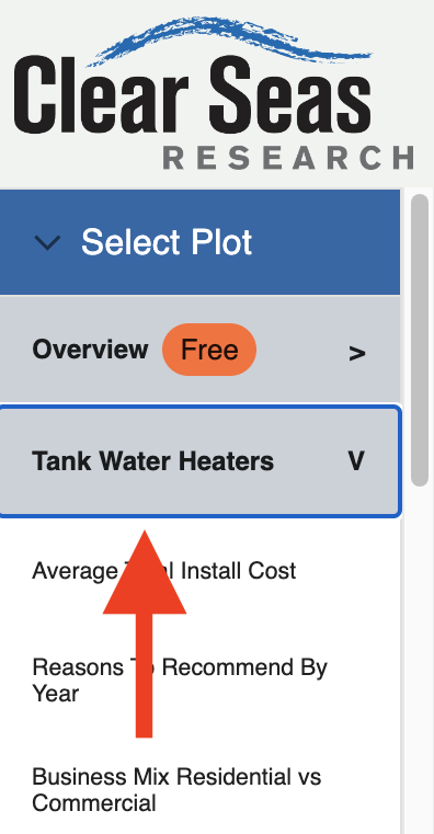
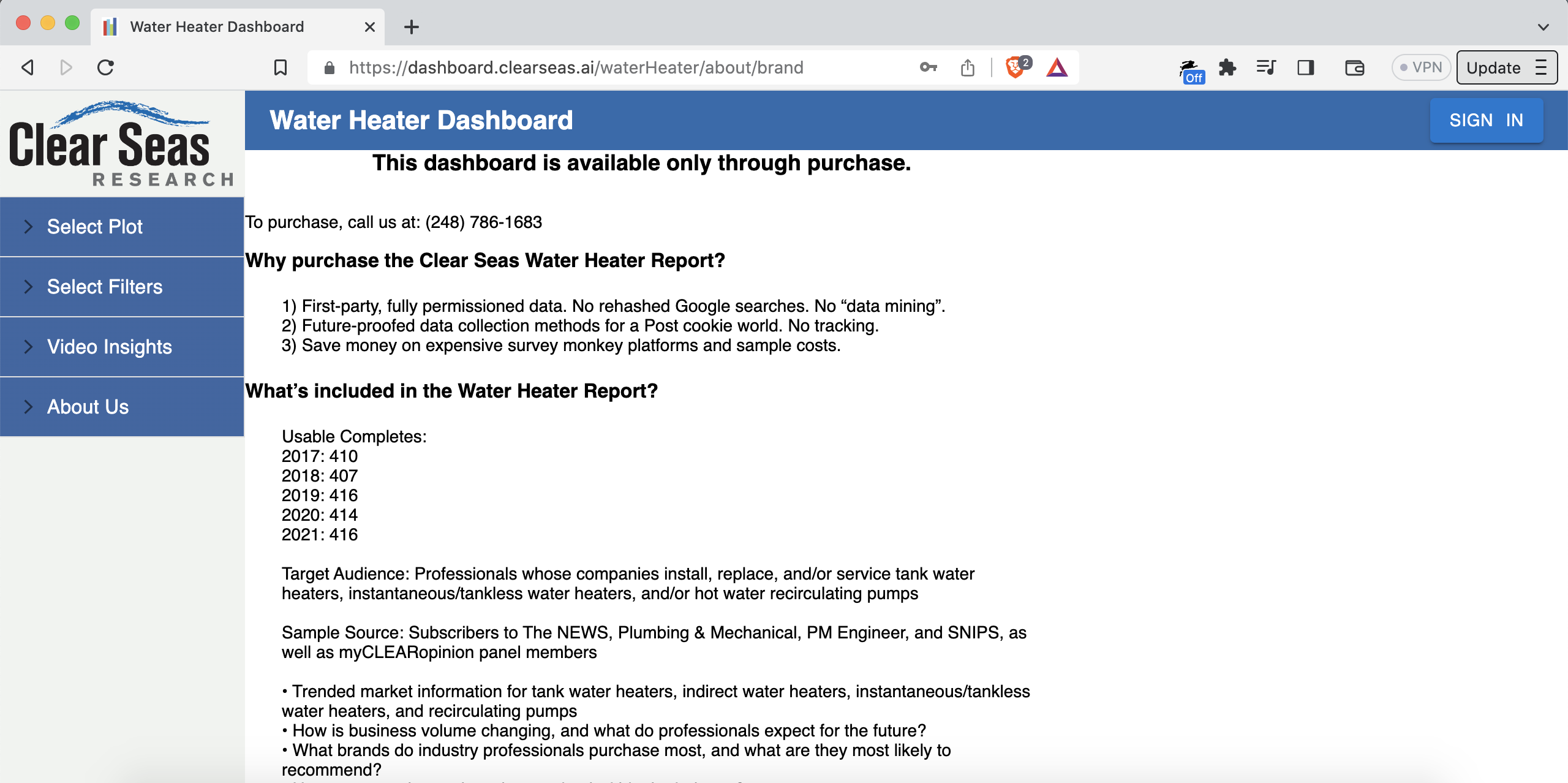
Those charts, however, are what we call “premium”. You need a paid license to see them. If you click into one, you’re directed to the page explaining how to purchase the premium version of the dashboard.
In particular, there’s a chart with the exact data we want! It answers the question: where do small companies buy tank water heaters?
Here’s the link to the chart: dashboard.clearseas.ai/waterHeater/plot/tankWaterHeatersPurchaseChannels?companySizes=companySize1,companySize2
You can’t access that chart unless you buy the dashboard, but I’ll give you the answer: Amazon and Home Depot.
Long story short: AO Smith may want the tank water heaters it sells through Amazon and Home Depot to be the kinds that small plumbing companies prefer installing.
AO Smith may also want to dial back the non-tank options.
Companies like AO Smith purchase these dashboards to get these insights.
AO Smith, the market leader in hot water heater manufacturing, does $3.539B/year in revenue. Purchasing a dashboard like this is a great investment.
Furthermore, this dashboard represents a step-change in market research technology. Nobody else has something like this: charts for custom data sources, emailable deeplinks to browser-based charts, filters, side-by-side chart comparisons, and so on.
Research reports are traditionally delivered as a single file. For example, a PDF. Each page of the PDF has a chart and some commentary. Here’s the problem: in a PDF, you can’t “slice and dice” the data via filters. Nor can you easily do side-by-side comparisons.
On this platform, one does the “slicing-and-dicing” of the data via filter checkboxes like this:
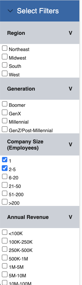
You can select any combination of those checkboxes, and the chart updates in real-time.
At one point, we calculated the number of combinations of charts and filters in a typical “dashboard type”. It’s over 1 billion. Can’t a have a billion-page PDF.
There are similar features in some proprietary tools like Tableau. But, they’re not browser-based. They also can’t easily use a client’s custom-format data. Mitchell can either do the research study himself (“end-to-end”), or, if the client already did the study, quickly and easily build a dashboard using data provided by the client. He can build a dashboard with your data regardless of where it came from: SurveyMonkey, Forsta, Qualtrics, etc.
To put it more candidly, clients love this platform.
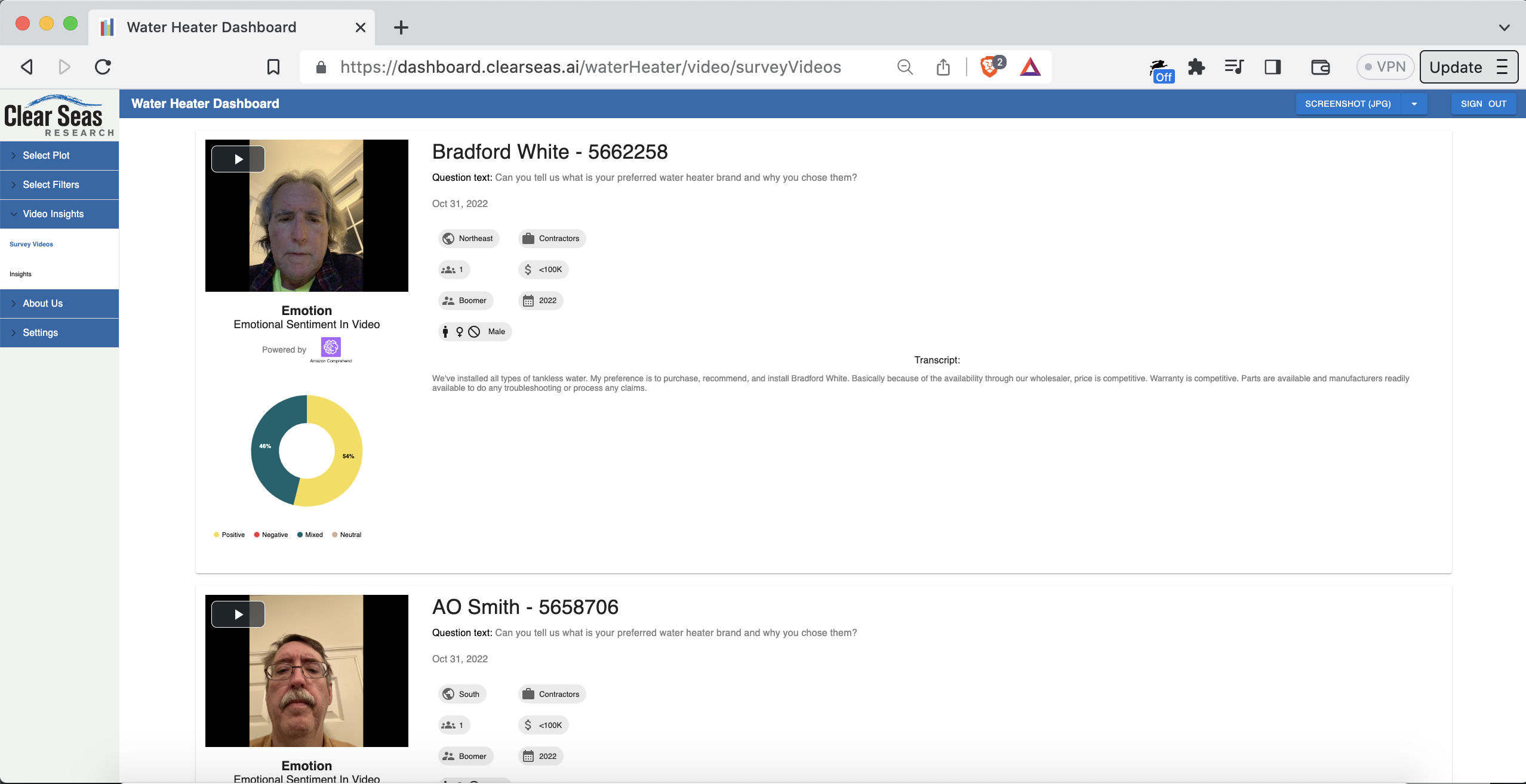
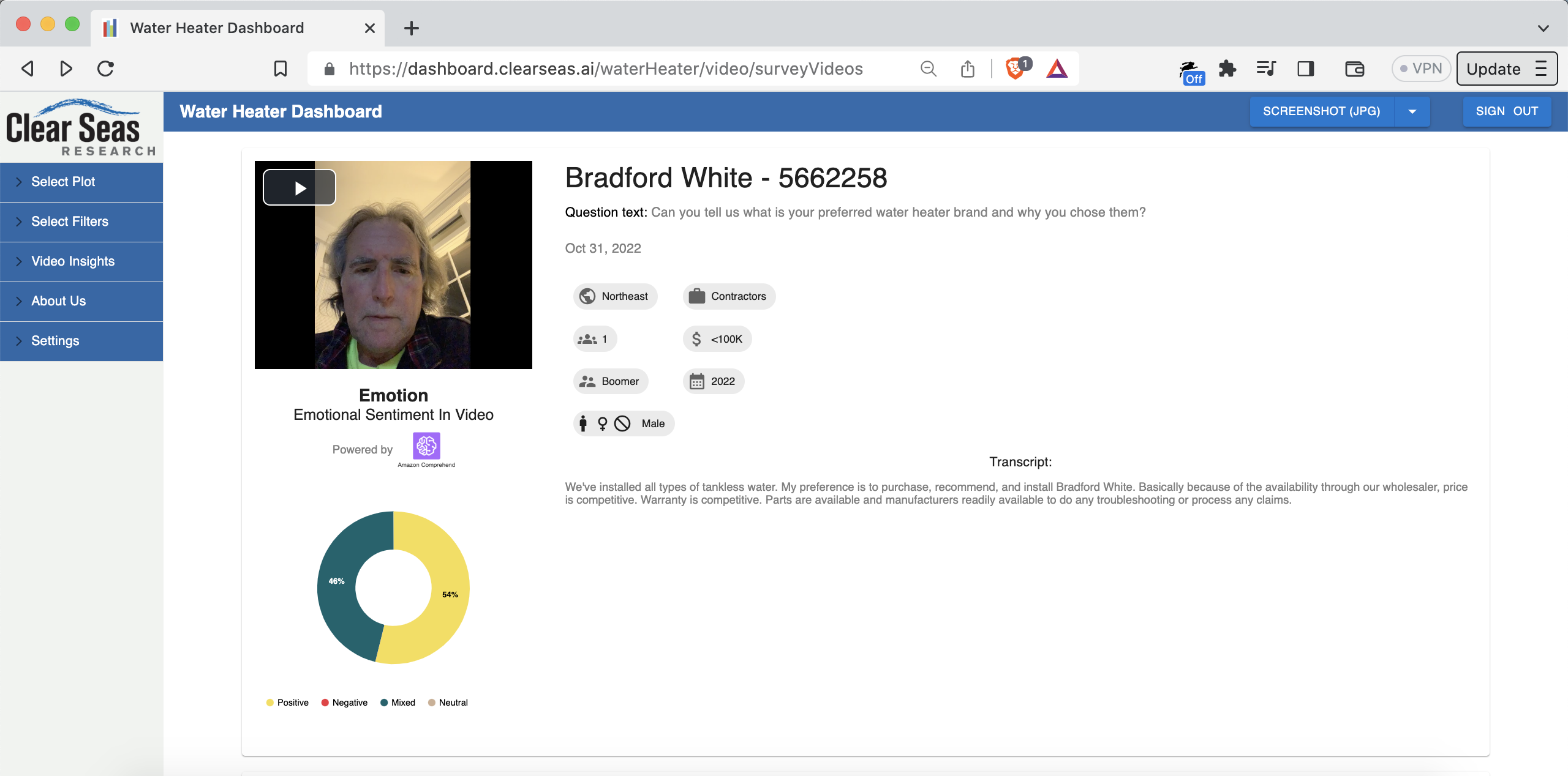
As mentioned, Mitchell’s company, Clear Seas Research, does “end-to-end” market research. For example, they have a verified panel of people who work as professional hot water heater installers. You can see some of those people in the video thumbnails here (they agreed to have their videos shared, by the way): dashboard.clearseas.ai/waterHeater/video/surveyVideos
The report data, therefore, is “fully-permissioned” and “first-party”. “First-party” is key. Some research organizations get their data from the glorified equivalent of a Google search. Some even just make stuff up.
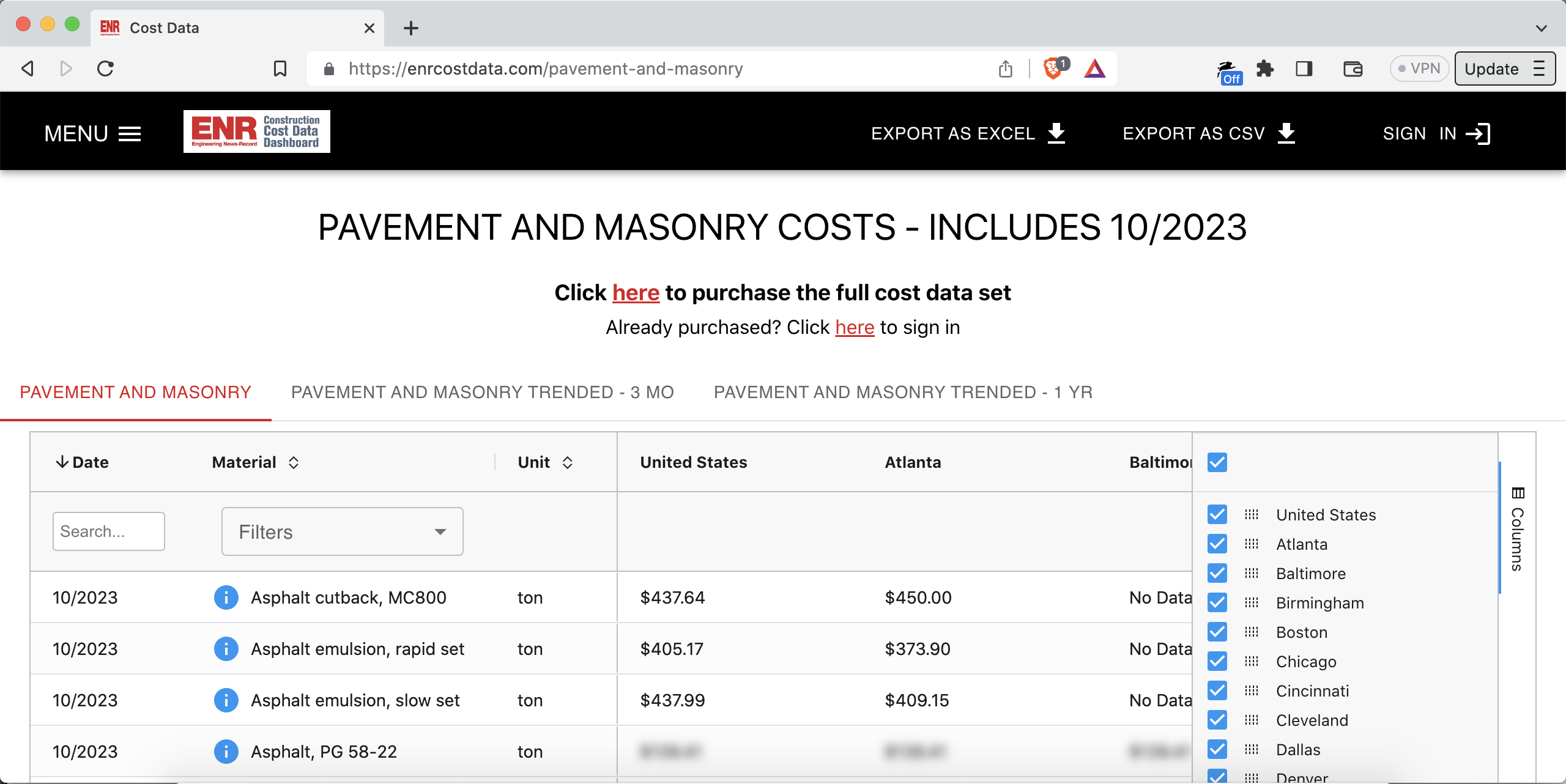
Here’s another “dashboard type”, this time for the roofing industry: dashboard.clearseas.ai/RCSOI

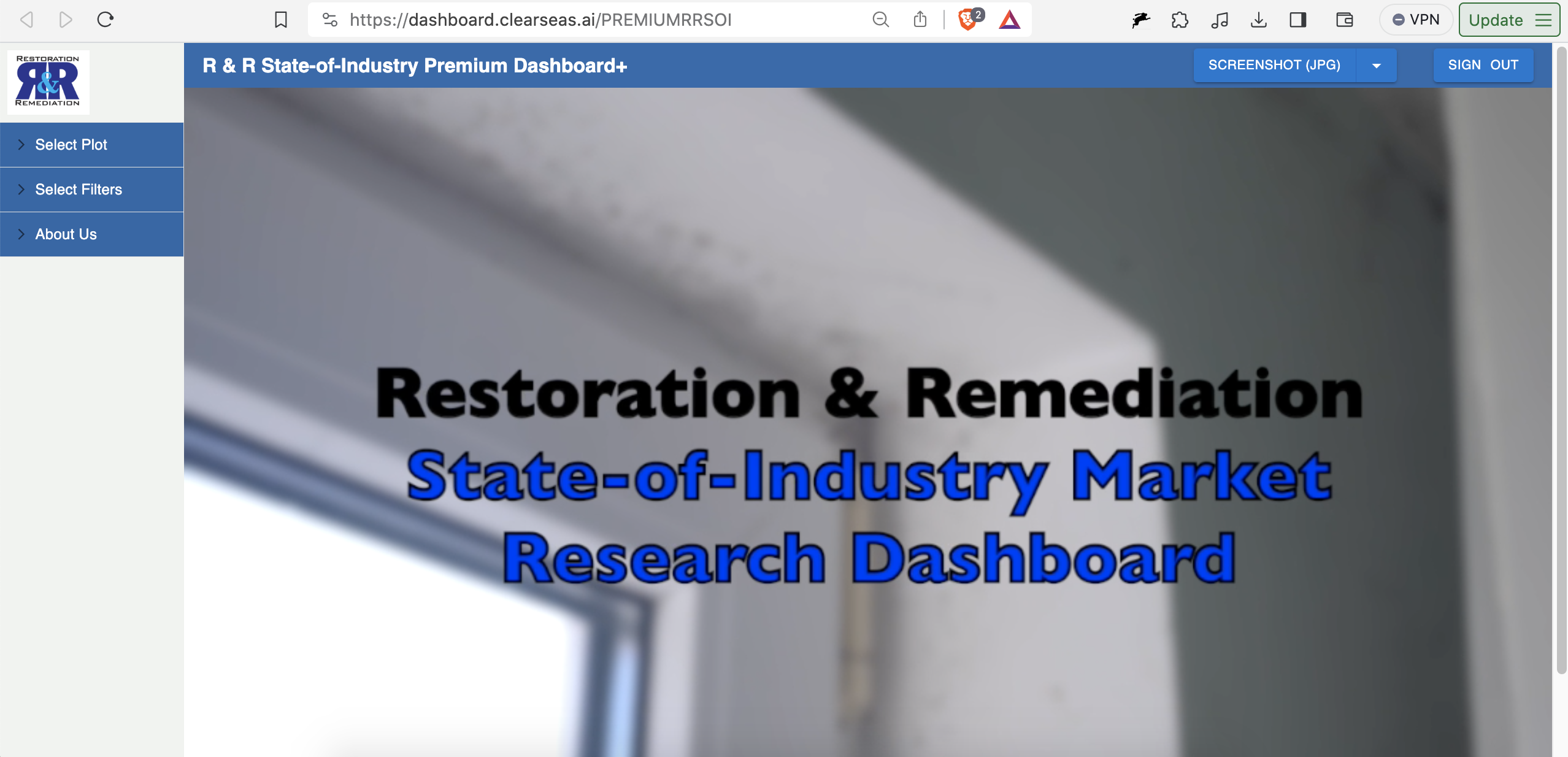
Restoration and remediation: dashboard.clearseas.ai/PREMIUMRRSOI
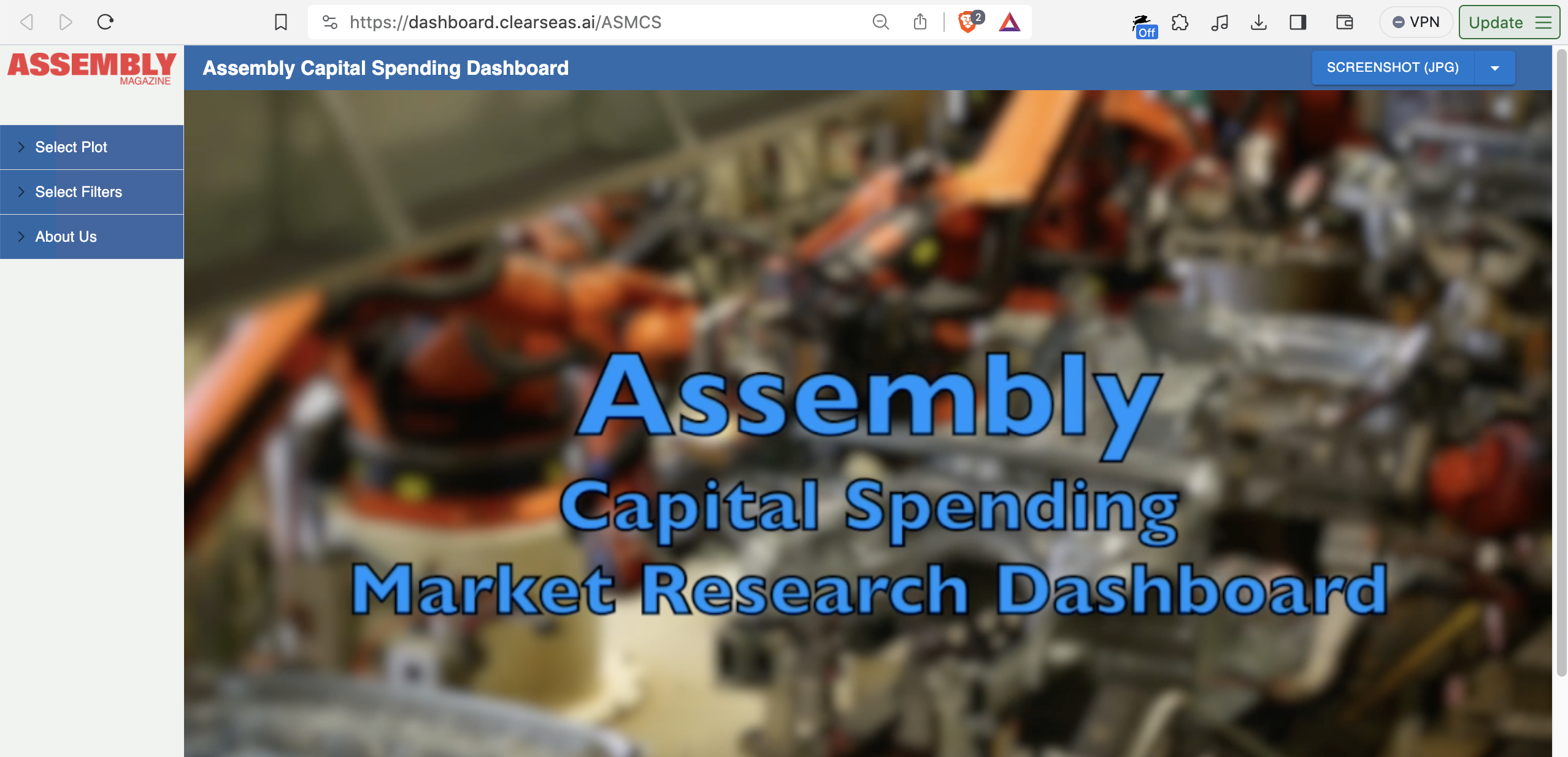
Capital spending on assembly manufacturing: dashboard.clearseas.ai/ASMCS
And so on.
The domain name is .ai…so what’s the AI part?
Three things:
-
Harken back to our example above: which size companies install which types of water heaters.
Notice the “AI Analytics” tab right above the plots? Here’s a deeplink: tinyurl.com/mrfszzv4
In that tab, you can chat with the data via a large language model (LLM) that has as context all the data, and all the filters, in both charts. You get answers in natural language.
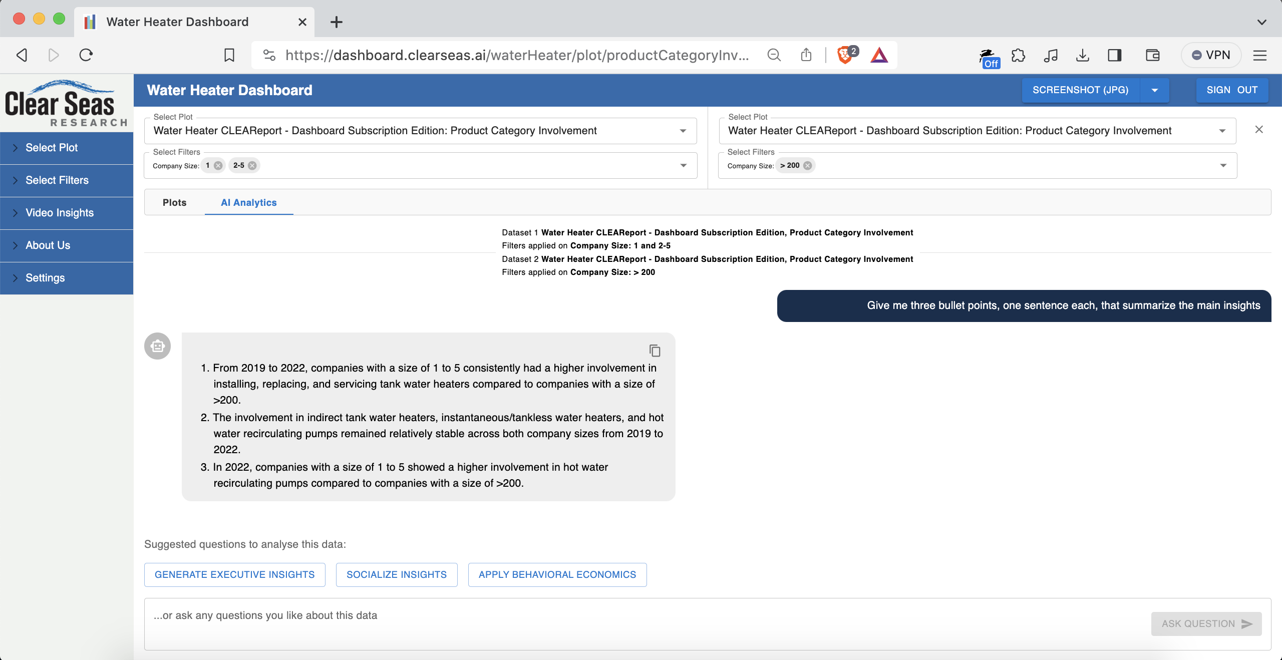
There are a few preset prompts to get you started. For example, “Generate Executive Insights”, which prompts “Give me three bullet points, one sentence each, that summarize the main insights”.
An example of some of what I got when I pressed the “Generate Executive Insights” button:
- For companies with a size of 1 or 2-5, the installation, replacement, and servicing of tank water heaters consistently ranged from 90.65% to 93.27% between 2020 and 2021.2.
- In contrast, involvement with indirect tank water heaters remained relatively low with percentages ranging from 34.82% to 37.50% during the same period.
Pretty relevant insights!
This is powered by an OpenAI large language model API, interacted with via the Node.js backend. This feature has been a real favorite for users. People don’t want data; they want actionable insights.
-
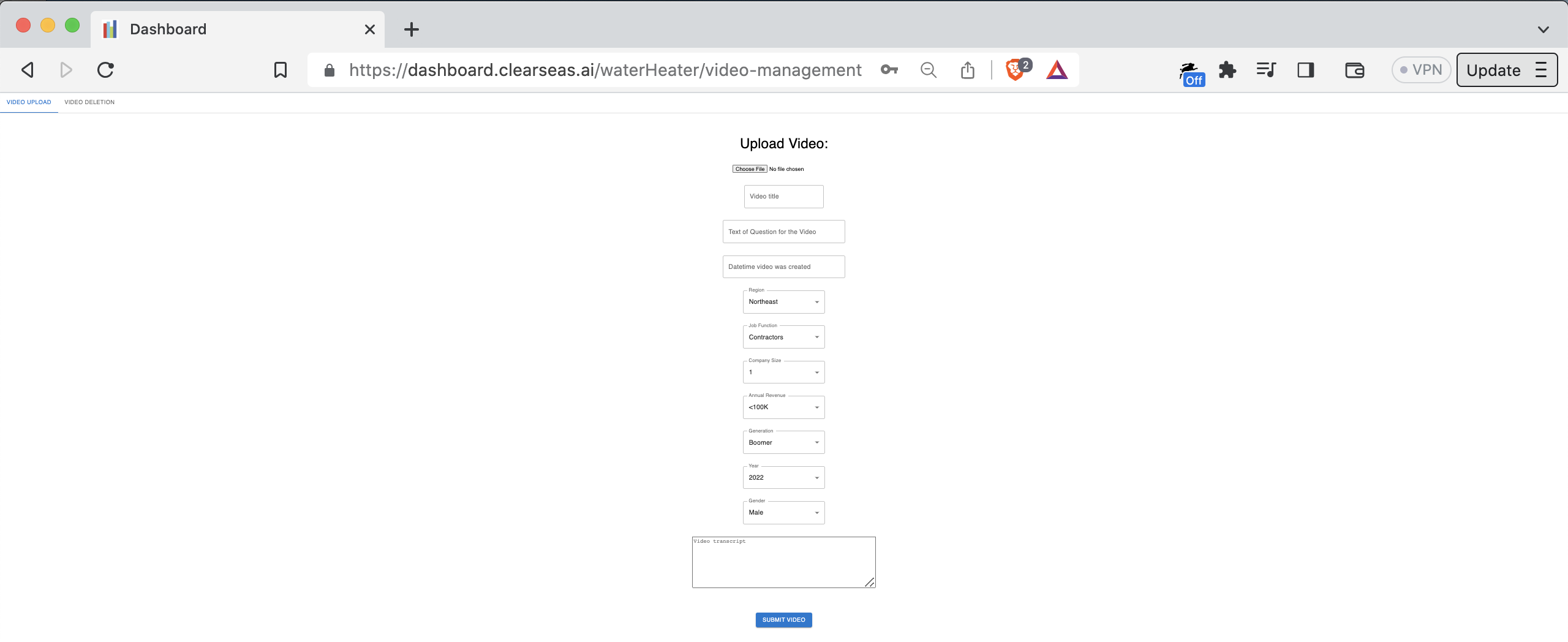
The platform has an AI-powered video insights section, which you can see here: dashboard.clearseas.ai/waterHeater/video/surveyVideos
When the videos and their transcripts are uploaded, the system runs sentiment analysis (NLP/NLU) on the transcripts, stores the results, and visualizes them next to the video in question. You can see the sentiment and thumbnail as a preview. You need a premium account to watch the video and see the un-blurred transcript.
Video upload page:
Video cards on video insights page:
There’s also a visualization of aggregate sentiment, among all respondents, per question: dashboard.clearseas.ai/waterHeater/video/surveyVideoInsights
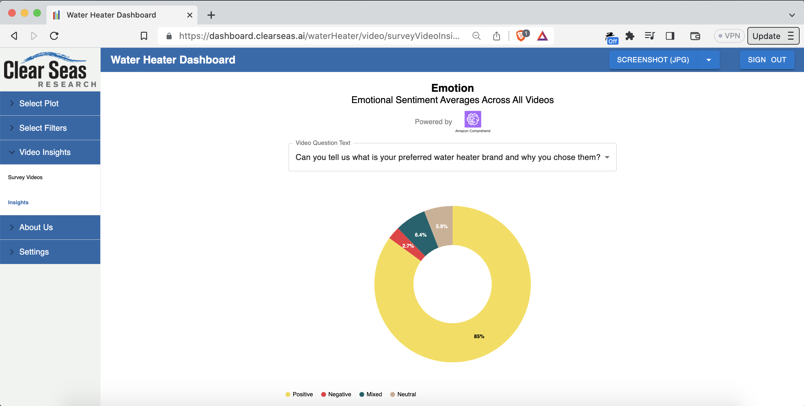
The dropdown is populated with the questions that were asked in the survey. You can select a different question from the dropdown to see the average sentiment for answers to that question among all respondents.
Potential future work that’s been discussed for the video insights feature:
• Batch upload
• Automatic generation of the video transcripts based on the audio tracks (probably using Amazon Polly)
• Classification of emotion (positive, negative, mixed, neutral) directly from video frame images (probably using Amazon Rekognition). Separately, classification of emotion from the audio (probably using Amazon Transcribe and Amazon Comprehend). The current system uses only the text. Going multimodal would make the classification more robust. Could experiment with tuning per-modality weighting to see what’s highest-fidelity to the truth.
• Going end-to-end with video sourcing. Mitchell currently uses a platform called Voxpopme (voxpopme.com) to collect the videos. The respondents (e.g. plumbers) receive prompts and record their response videos through that platform.
• Mitchell and his staff then upload the videos into the relevant dashboard. Mitchell’s software engineering team could instead build the video surveying themselves! It would do exactly what they want, and it would connect right into the video analysis part that already exists.In other words, the vision is:
- A contractor who installs water heaters would get a text message with a link to a paid survey
- They click the link, record the video, and get paid automatically
- The video is automatically uploaded to the relevant dashboard type (water heaters, roofing, manufacturing, etc.)
- The video is also automatically processed by the AI subsystems for voice-to-text and emotion classification
- The videos show up on the relevant dashboard in real time, complete with emotion classification and the other metadata (age of respondent, region of the US the respondent hails from, etc.)
It was awesome to be able to design, build, and deploy all parts of the video management system:
• The infrastructure: AWS with Terraform
• The CI/CD pipeline pieces: GitHub Actions
• Video upload via an admin interface in the platform: full-stack React and Node
• Video processing (FFmpeg), storage (S3 and RDS), sentiment analysis NLP/NLU, and frontend display of the videos and associated sentiment data.This was a great example of efficient and enjoyable product development. Mitchell and I talked through the feature, then I built it, demoing to Mitchell along the way. End-to-end delivery was about one month, in the fall of 2022.
Another feature I built in the fall of 2022 is the ability to generate a PowerPoint presentation from a list of videos.
When Mitchell brought this up to people, the response was “nuclear” (in a good way). The feature is a button on the video uploads page that says “Download as PowerPoint”.
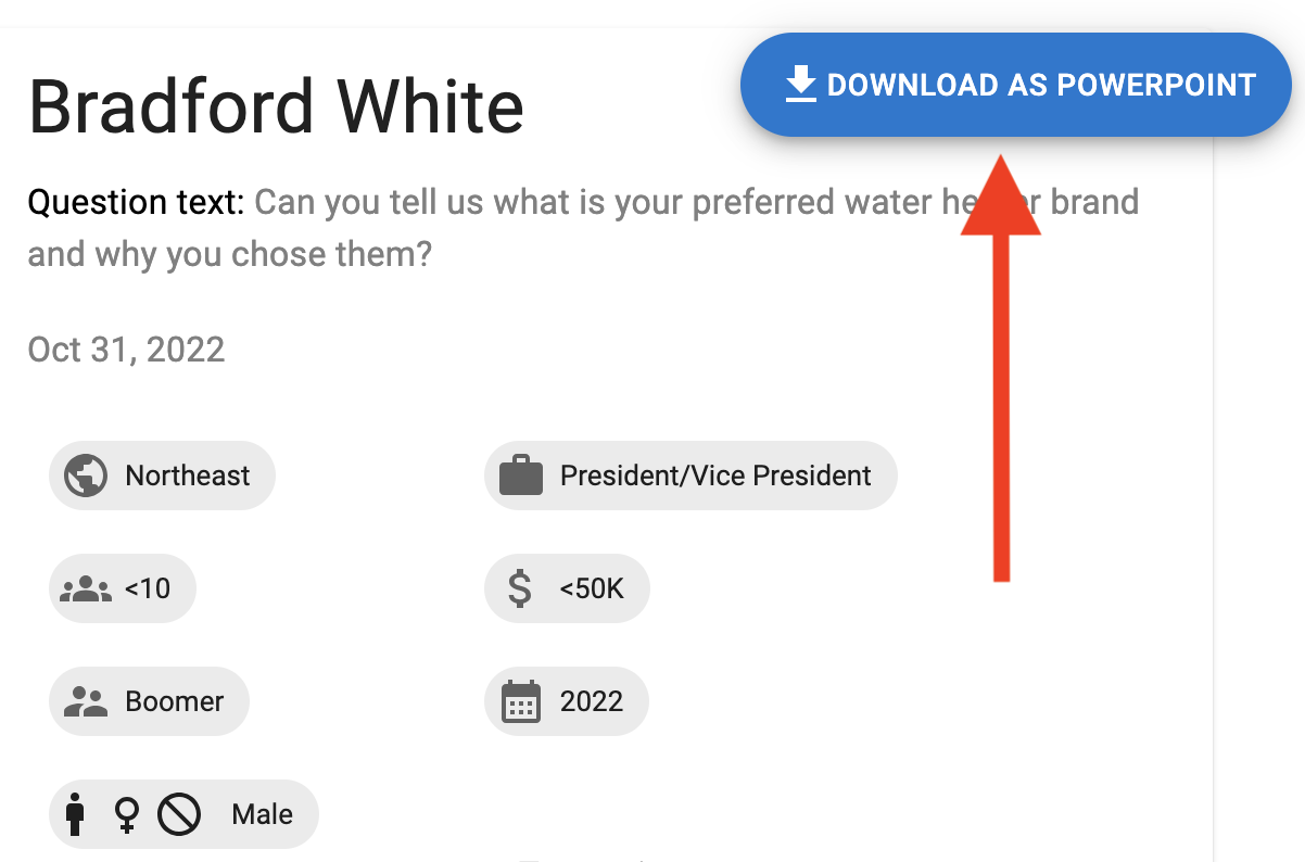
When the user clicks that button, the system generates a PowerPoint presentation with one video “card” per page:
This feature is currently working in a Git feature branch (needs a few final tweaks)
This is a next-level timesaver for market researchers. That’s particularly true if they can batch drag-and-drop videos straight to conversion into a PowerPoint generation.
On the technical side, it was interesting working on PowerPoint generation in Node.js.
- A contractor who installs water heaters would get a text message with a link to a paid survey
-
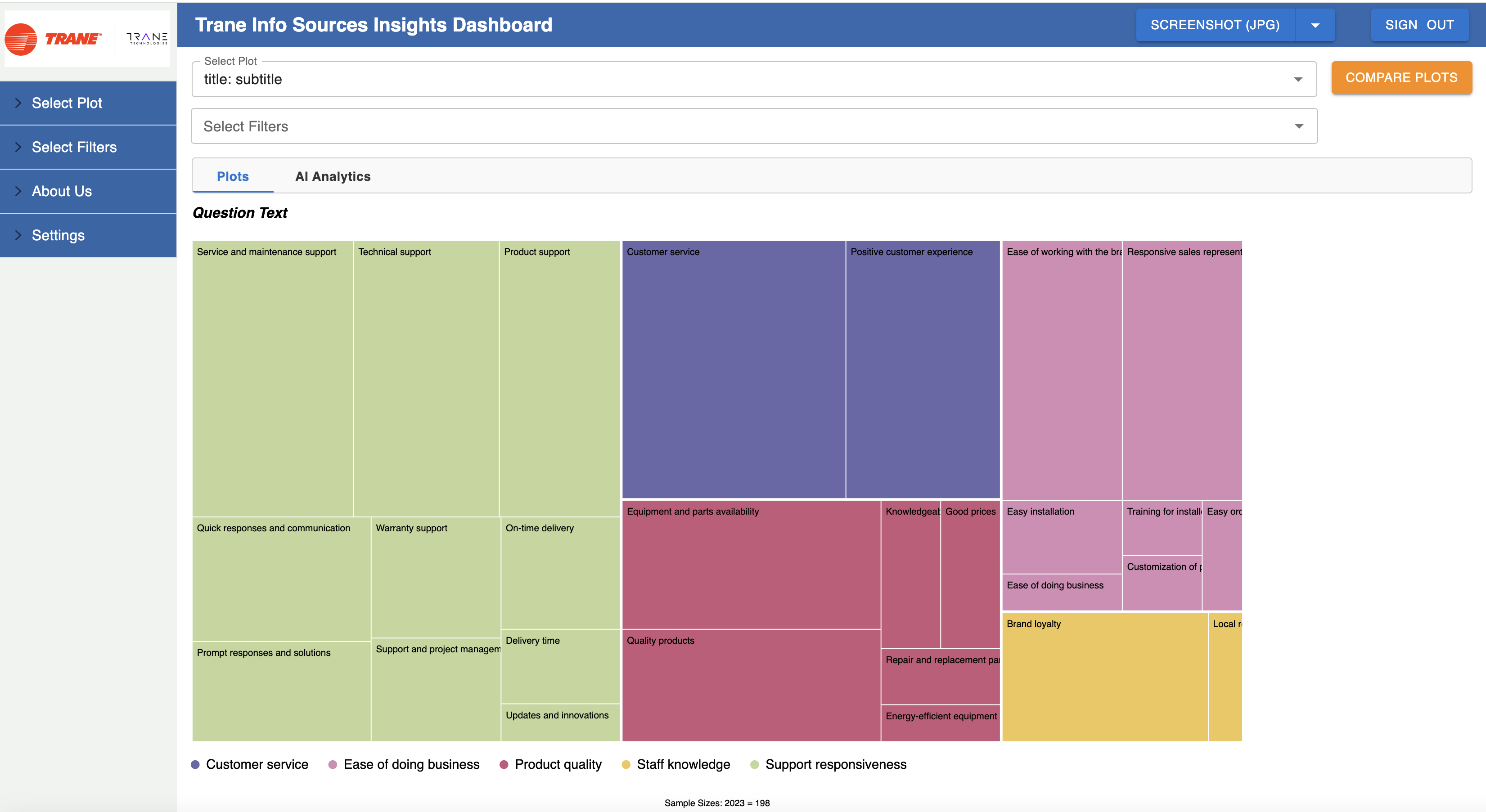
Also built, and currently working in a Git feature branch: a custom clustering and summarization NLP/NLU model that categorizes answers people give to free-form text questions (the industry term is “open-ends”).
For example, let’s say 100 people were asked “can you tell us what is your preferred water heater brand and why?”. The model takes in the 100 answers and generates a few “summarized” points that represent the key ideas across those 100 answers.
This is a cool one: it’s a custom model that does sentiment-based clustering and per-cluster summarization. It’s LangChain-based and trained in AWS SageMaker. The output is visualized with a treemap-style chart.
Here’s an example of a real result:
What about the tech side?
One area that particularly stood out: interesting DNS work.
Per customer request, a few dashboard types, such as Assembly Capital Spending (dashboard.assemblymag.com/ASMCS), have custom domain names in which the root domain (assemblymag.com) is hosted by the 3rd-party customer. In other words, the domain isn’t hosted in Mitchell’s AWS account.
We solved that using DNS delegation. In particular, pointing the external nameservers for only the dashboard. subdomain to our AWS Route 53 Hosted Zone’s NS records. Turns out you can have separate nameserver DNS records for the root domain and a subdomain. Didn’t know that before this project!
The final leg of DNS delegation to the ALB is just an A record.
So it’s:
NSrecord DNS entry performed by the 3rd-party client hosting the core domain- Route 53 Hosted Zone for just the subdomain.
You can create a hosted domain for whatever DNS value you want, even without having AWS as the domain registrar for the relevant domain. You get nameservers and all. If something delegates to those nameservers, you’re in business. Here’s an example:- An A record pointing to the ALB’s FQDN DNS entry (as in the Terraform-generated ALB’s FQDN partially visible in the screenshot above).
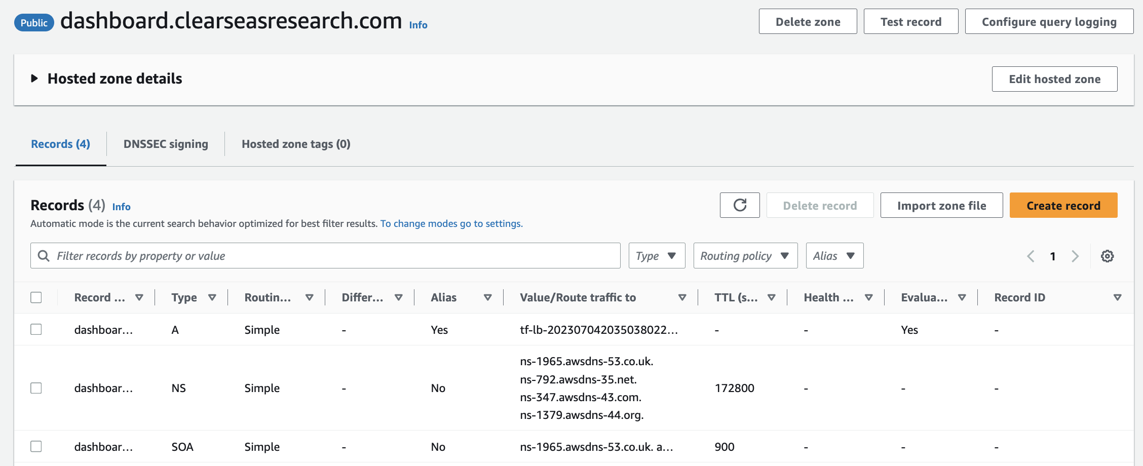
We solved the TLS problem using:
- ACM-generated, Route 53-validated certs (all via Terraform!). The cool thing about NS-based delegation is you can add validation records like
CNAMEs andTXTs to the Hosted Zone and they resolve just fine. ACM-managed certs mean auto-renewal/no-hassle.- A cool feature of ALBs called Server Name Indication (SNI). SNI lets you attach multiple TLS certs to a single ALB. AWS added SNI in 2017 (tinyurl.com/5yf3pf5n). Our frontend ALB has 12 certs attached; 11 through SNI.
Digital transformation:
When I joined, the project was in a relatively early stage of development. The codebase had at that point been built out entirely by a single software engineer. That person later took a job as a software engineer at Facebook/Meta, so Mitchell sought out a new engineer to work on the project. That’s how Mitchell and I got connected.
That software engineer did a great job creating a capable MVP. It was, and still is, written with a Node.js backend and a React frontend. I used Spring Boot (Java) as the backend framework for the greenfield projects for Mitchell. There wasn’t reason to migrate the (fairly complex) Node.js backend to Spring Boot.
Digital transformation of the infrastructure:
Before:
• Single on-premise server: no load balancing. (Small) downtime during deployments.
• PM2 for Node process management
• Deployment process: SSH onto machine ->git pull-> stop Node process-> optionallynpm i-> start Node process
• No database
• No user profiles/auth/ability to sign up/ability to sign in
• No log collection/persistence/searchability
• Manually-managed certs (provisioning, renewal, etc.)
After:
• Monorepo containing backend microservice (Node.js), frontend microservice (React), infrastructure-as-code (Terraform), end-to-end automated tests (Cypress), and pipeline-as-code (GitHub Actions).
• Dockerized. One image per microservice, stored in private ECR repos. Image tagged with commit hash for traceability.
• Deployed in AWS on ECS. Blue/green deployments, high-availability configuration, log collection from the containers into per-microservice-per-environment-segmented CloudWatch log groups. Serverless: low-hassle and impossible to SSH onto. Total of zero SSH key pairs for the app servers.
• Data tier is PostgreSQL in RDS, with scheduled automated backups, data encrypted at rest, etc.
• Pipeline has linting (including linting of the Terraform code!), automated testing, SonarQube, etc.
• Snyk for security scanning: SAST, SCA, IaC (Terraform) scanning, and Docker image scanning
• SonarQube Quality Gate gating in the pipeline. Failing the Quality Gate fails the build and blocks all deployments to all cloud environments.
• End-to-end automated tests written in Cypress (in TypeScript!), including visual snapshot tests for charts. The end-to-end tests run in the pipeline on pushes to all branches, and they gate deployment from the main branch to any of the cloud environments.
• A separate set of read-only e2e tests run on a cron, via GitHub Actions, against production, as a piece of the monitoring strategy for the platform
• Separate staging and production environments. One infra codebase in the monorepo parameterized by environment. Environments implemented with Terraform workspace.
• Uses GitHub Actions “environments” feature to restrict production deployments to only a subset of GitHub repo-permissioned users. Standing up a new environment is trivial: less than a day’s work.
• Per-environment configuration such as service-specific URLs is provided via environment variables, per The Twelve-Factor App Methodology (12factor.net).
Digital transformation of the application code:
• Built out authentication and authorization, including the ability for one user to have premium access to more than one dashboard type, with different dates if needed. Solution leverages a multitenant architecture.
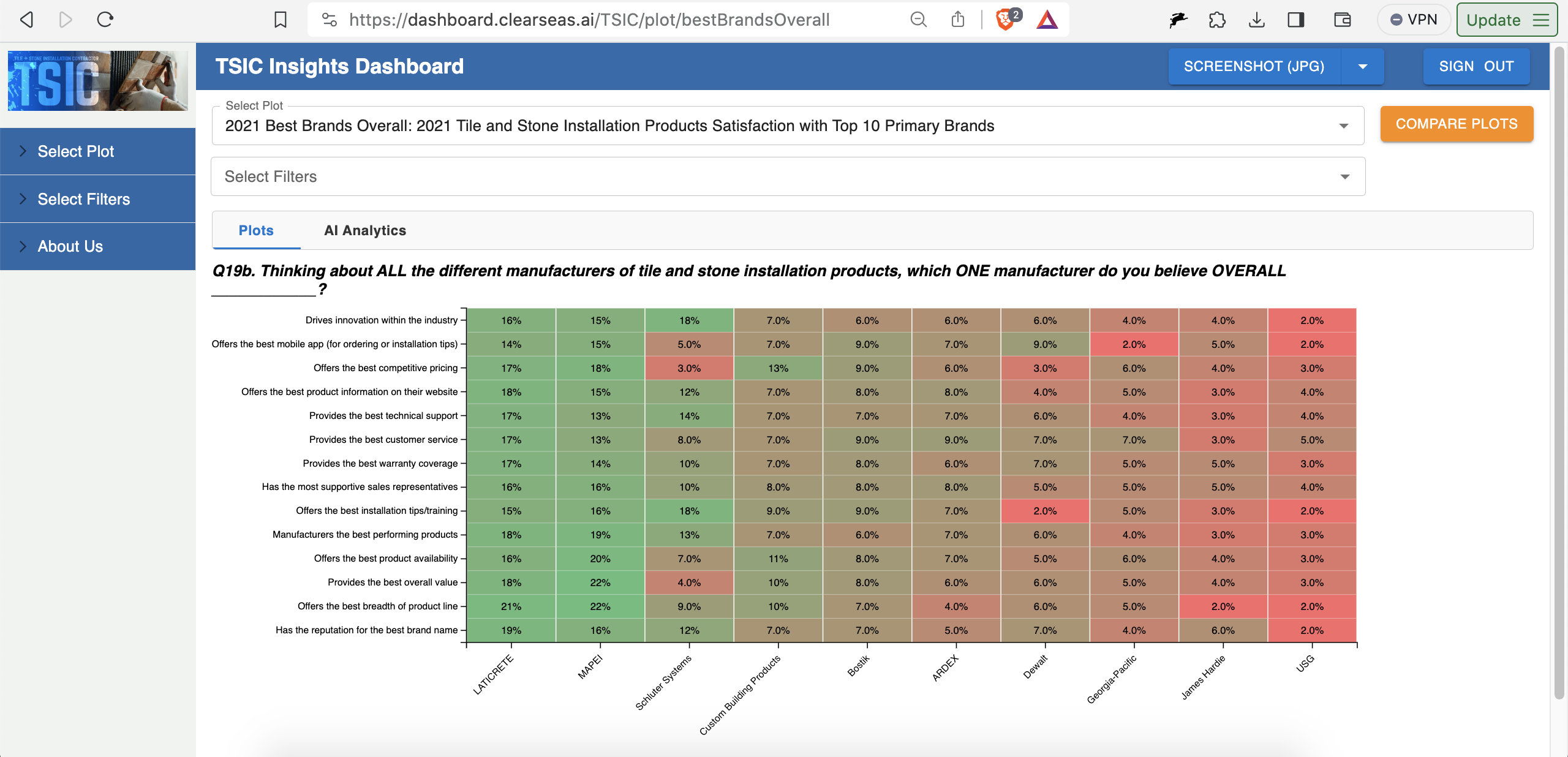
• Built out a number of new chart types, including the heatmap chart type (e.g. dashboard.clearseas.ai/TSIC/plot/bestBrandsOverall):
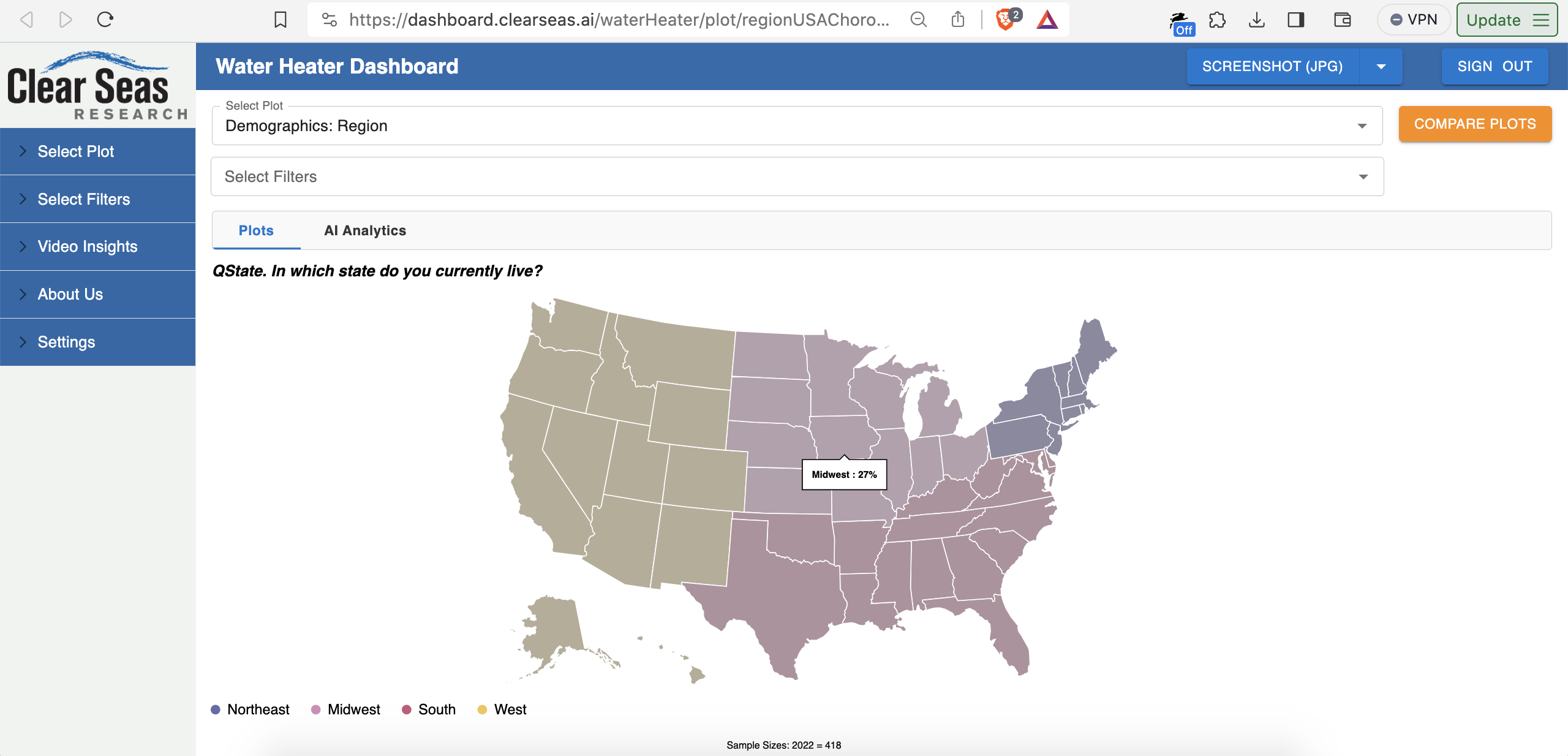
and the USA choropleth chart type (e.g. dashboard.clearseas.ai/waterHeater/plot/regionUSAChoropleth):
• Videos insights feature discussed above
• Moved to more standard use of React Router. Prior implementation often leveraged the querystring piece of the URL instead of the path piece of the URL.
• Implemented Redux via Redux Toolkit (RTK) and moved relevant data into Redux. Auth data, chart data, currently-applied filters, etc.
• Migration to TypeScript for both frontend and backend is currently in progress
Over the past few months, we also built out a third application, which I’ll post about here soon. The third application is very related to the product described in this post.
Thank you Mitchell for making all of this possible. It was an awesome experience.
About a month ago, I took a new full-time corp-to-corp software engineering role through my consulting company. The role is with a large software company based in Massachusetts. More on that soon.